Home
Map
Profiles
Analysis
Assess

This dashboard provides an overview of the district (during the 2015–16 school year), along with individual school data, building reports, digital assets, and various data visualizations.
Four Ways to Use This Tool
Map Tool
Initial Map View:
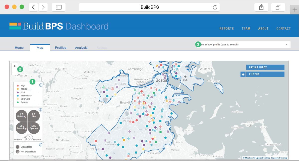
The map page includes each building and school owned or leased by Boston Public Schools. The colors represent the general school typology assigned to each school. The full legend is located in the far right bottom corner of the screen (1). You can use both a mouse wheel or the +/- toggle on the top right of the map to zoom in or out (2). Users can find a specific school of their choice by typing the name into the Quick Search bar (3).
Zoom and Expandability:
The map page includes each building and school owned or leased by Boston Public Schools. The colors represent the general school typology assigned to each school. The full legend is located in the far right bottom corner of the screen (1). You can use both a mouse wheel or the +/- toggle on the top right of the map to zoom in or out (2). Users can find a specific school of their choice by typing the name into the Quick Search bar (3).
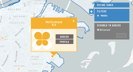
Filtering:
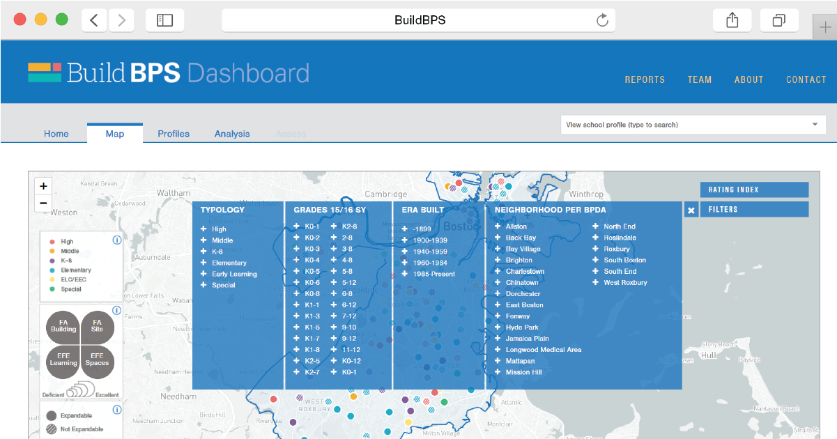
The filter tool allows specific criteria to be selected. The school results include all that meet this criteria. It is broken down into four categories of analysis for the buildings:
- Typology is the general school type
- Grades includes the specific range of grades offered per the 2015/2016 school calendar year
- Era Built includes the period of time the building construction was completed
- Neighborhood per BPDA are neighborhoods as defined by the Boston Planning and Development Agency (BPDA)
School Summary:
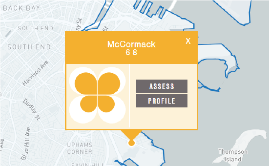
Each school’s summary will appear when the school dot is clicked on. It includes:
- The abbreviated name of the school (1),
- Grades offered (2),
- Access to the full profile of that school as well as ability to add the school to the assess list (3), and
- Overview ratings of the four main assessments studied (see key). This “clover” shaped icon is composed of four leaves, each representing a score of 1-5 that reflects how the building has been scored in each of the four primary assessment categories, with 1 being deficient and 5, excellent (4)
Rating Index:
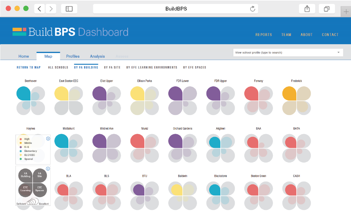
The rating index allows for sorting and viewing of all schools by the rating summary (clover) data. The rating summaries for the four assessment areas are: Facility assessment of the building (FA-B), facility assessment of the site (FA-S), Educational facility effectiveness of the building (EFE-BA), and educational facility effectiveness for learning environments (EFE-LE).
Profile Page
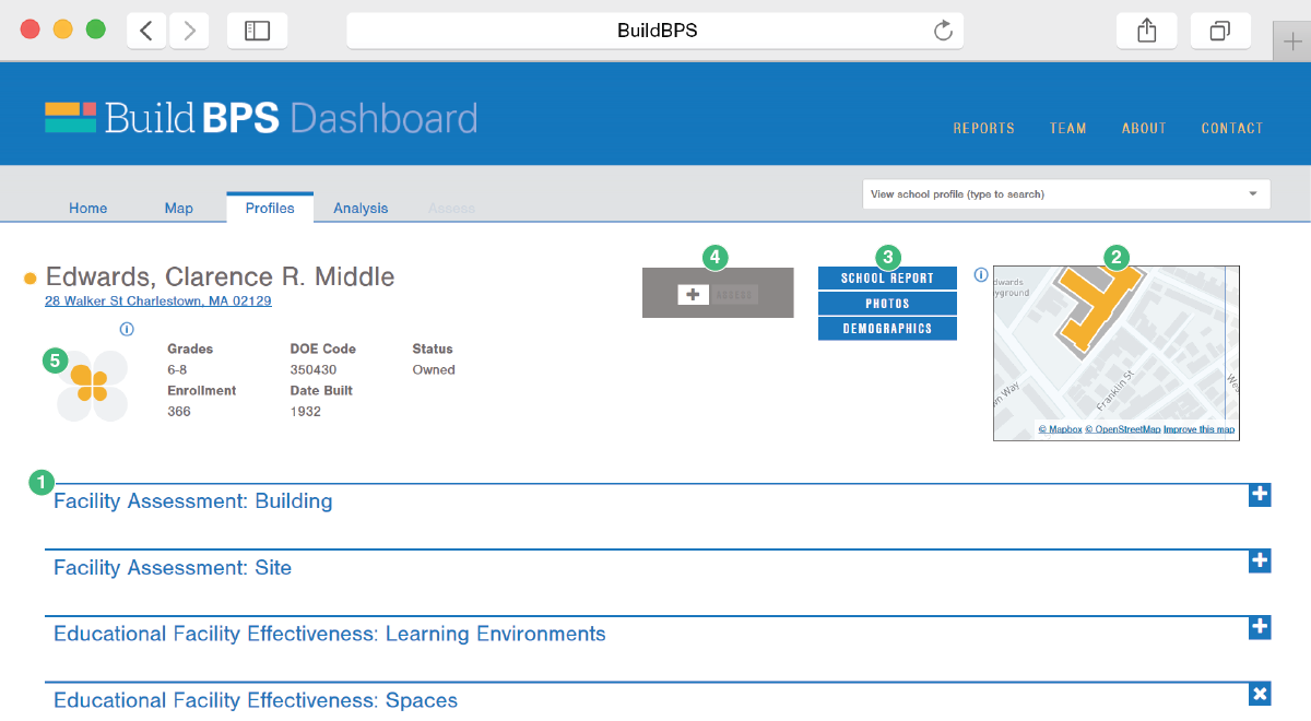
Each school is provided a profile page, which contains:
- The summary of the four primary assessments (1),
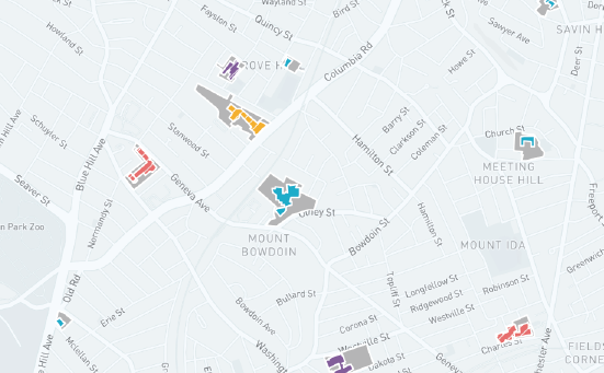
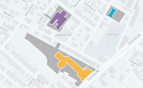
- Map thumbnail illustrating the building’s ability to expand or not (2),
- Links to download files specific to that school (3),
- Option to add that school to the assess list, as well as edit the assess list (4), and
- General overview information including a link to Google Maps (5),
Assessment Components:
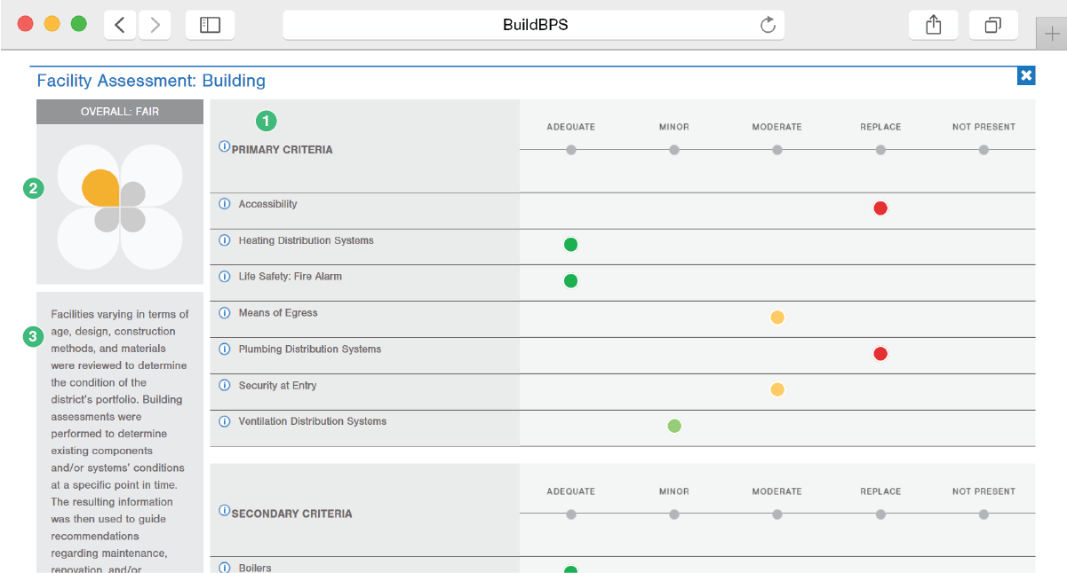
Each of the four primary assessments is shown as an expandable section. When expanded, the specific criteria that makes up each assessment is shown along with its score (1). Also provided is an overall score for each category (2) and explanation of what this assessment included (3).
Analysis Tool
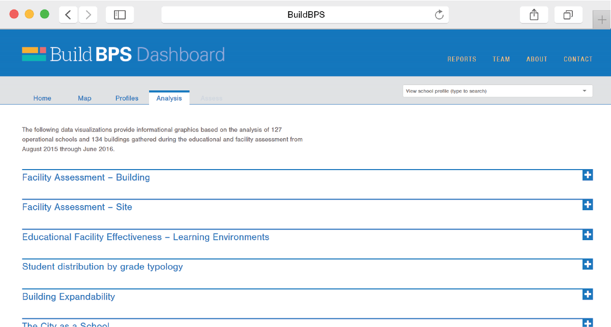
This tool includes seven questions that help analyze the data across all the schools. The data is presented in the form of visualizations, which have been created to communicate a wide range of information clearly and effectively. These graphics are interactive and are meant to help answer questions and generate ideas.
Assess Tool
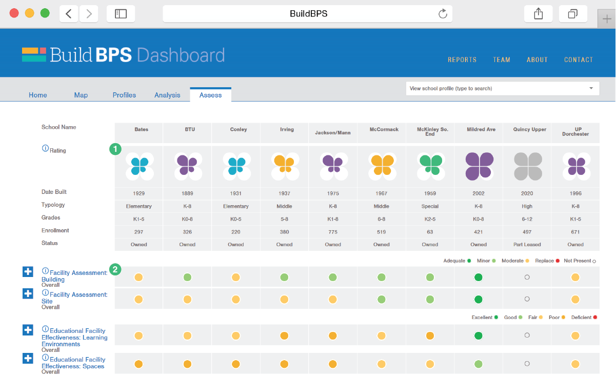
The assess tool can include up to 10 schools at a time. The top section includes overview information (1) while the lower sections (2) show the scores and criteria of the four primary assessments.